Encompass Reporting
Role
Lead Designer
Company
Encompass Technologies
Timeline
2 months - In beta
Could we significantly cut down on support efforts if analysts were no longer building custom reports for mid-level managers?
What if the reporting platform was modernized and competitive with other tools that our distributors use everyday?
However…
No one had a clear idea of what "modernizing reporting" meant, or what it would take to get our users to build their own reports.
"When am I supposed to create a comparison report instead of a fusion report?"
Our current tools were not giving users a good entry point—a common sentiment.
"I shouldn't have to pay for a training to do this."
Users were upset about being asked to pay for and complete a SQL training to go beyond our basic reports.
"40% of my time is spent building reports for customers."
Our support analysts had good numbers showing how much time they spent doing what should have been basic reports for our users.
Relevant
Users should be able to easily find the common groupings and values they work with every day.
Obvious
It should be obvious and simple for users to make common adjustments to reports. Training shouldn't be required to give users access to powerful data.
Powerful
Power users are the backbone of Encompass reporting as it is today. They should not lose access to powerful, advanced functions as the interface is simplified.
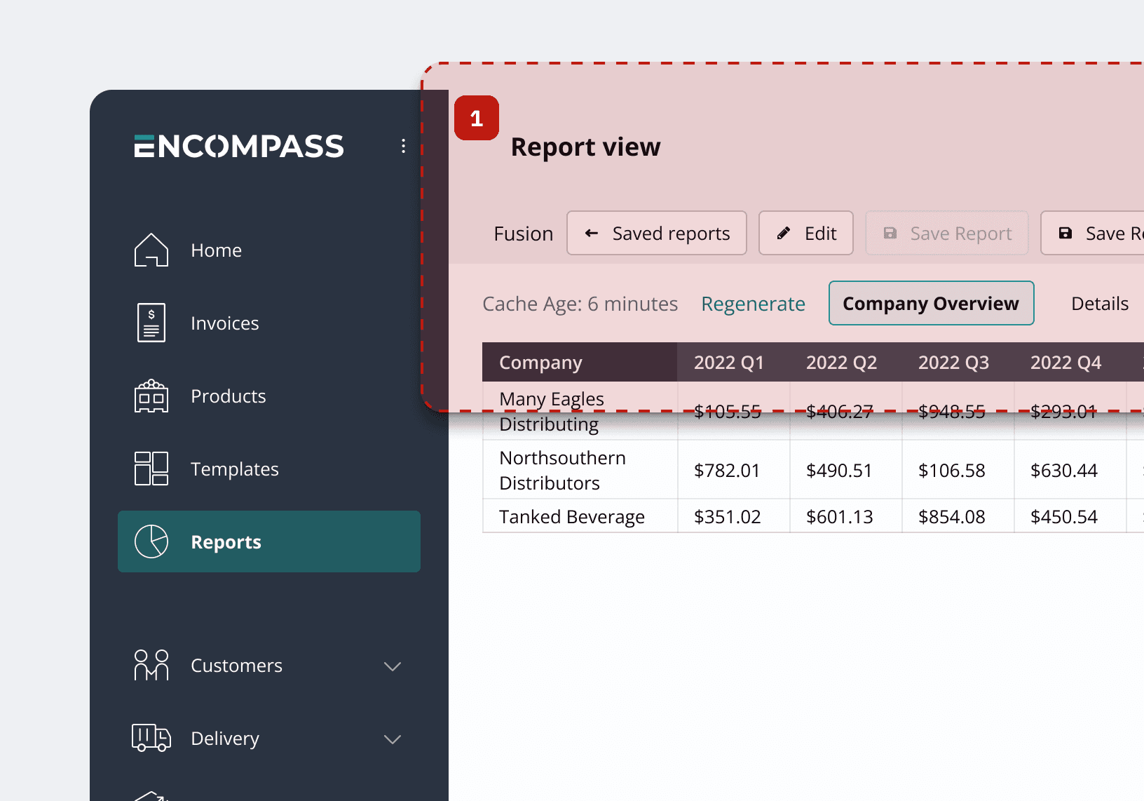
The report header was convoluted due to an incorrect representation of information hierarchy. Page navigation was placed inline with report controls.
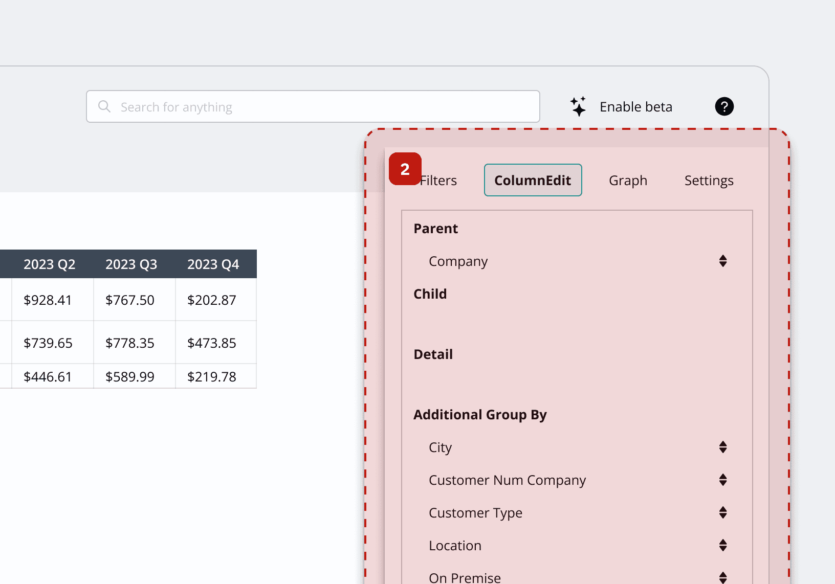
The "quick edit" panel was pushed to the right side of the screen, making it difficult to find at a glance.
To add a new "group by," users would drag items from "Additional Group Bys" up to "Parent," "Child," or "Detail." This common action often required required detailed user training.
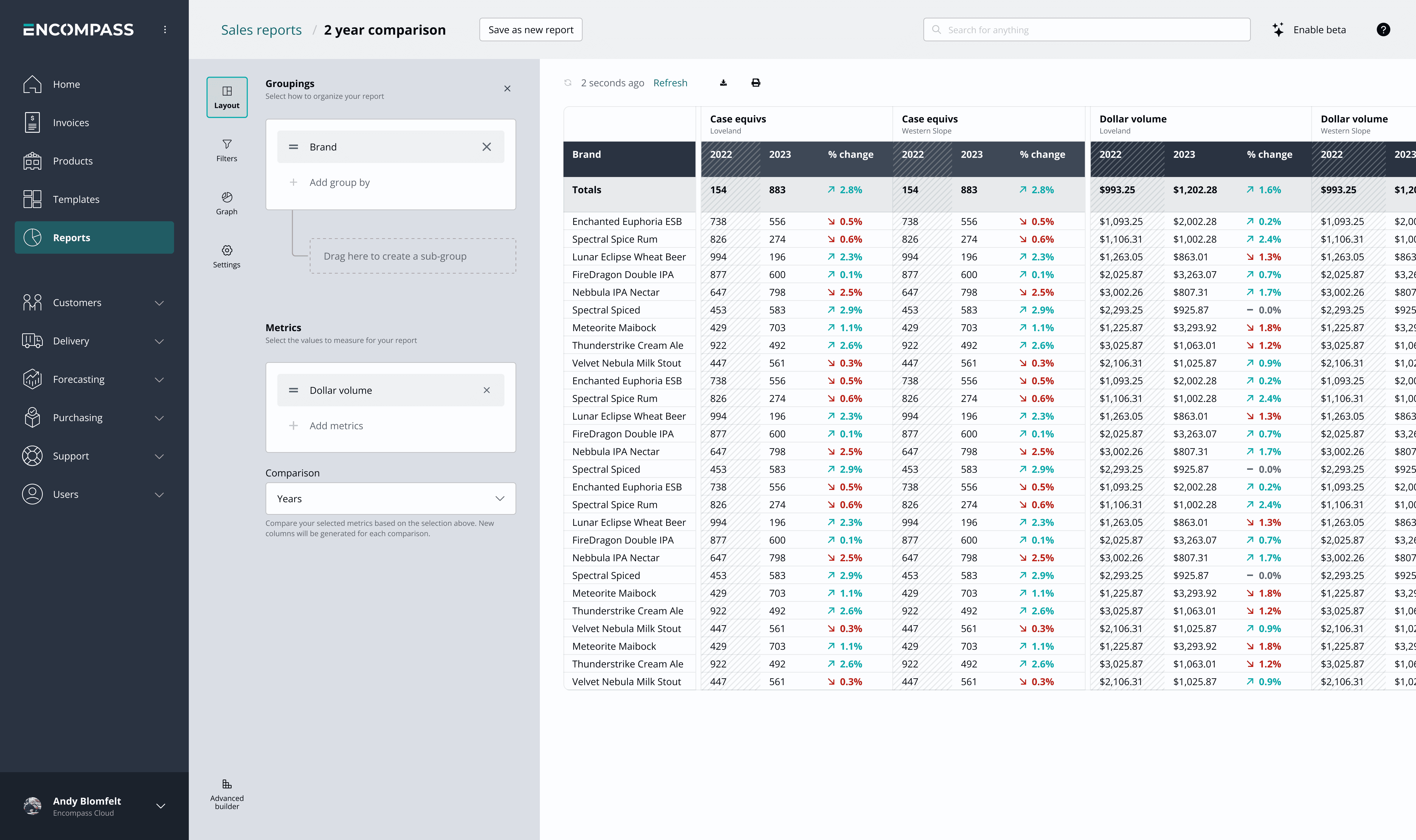
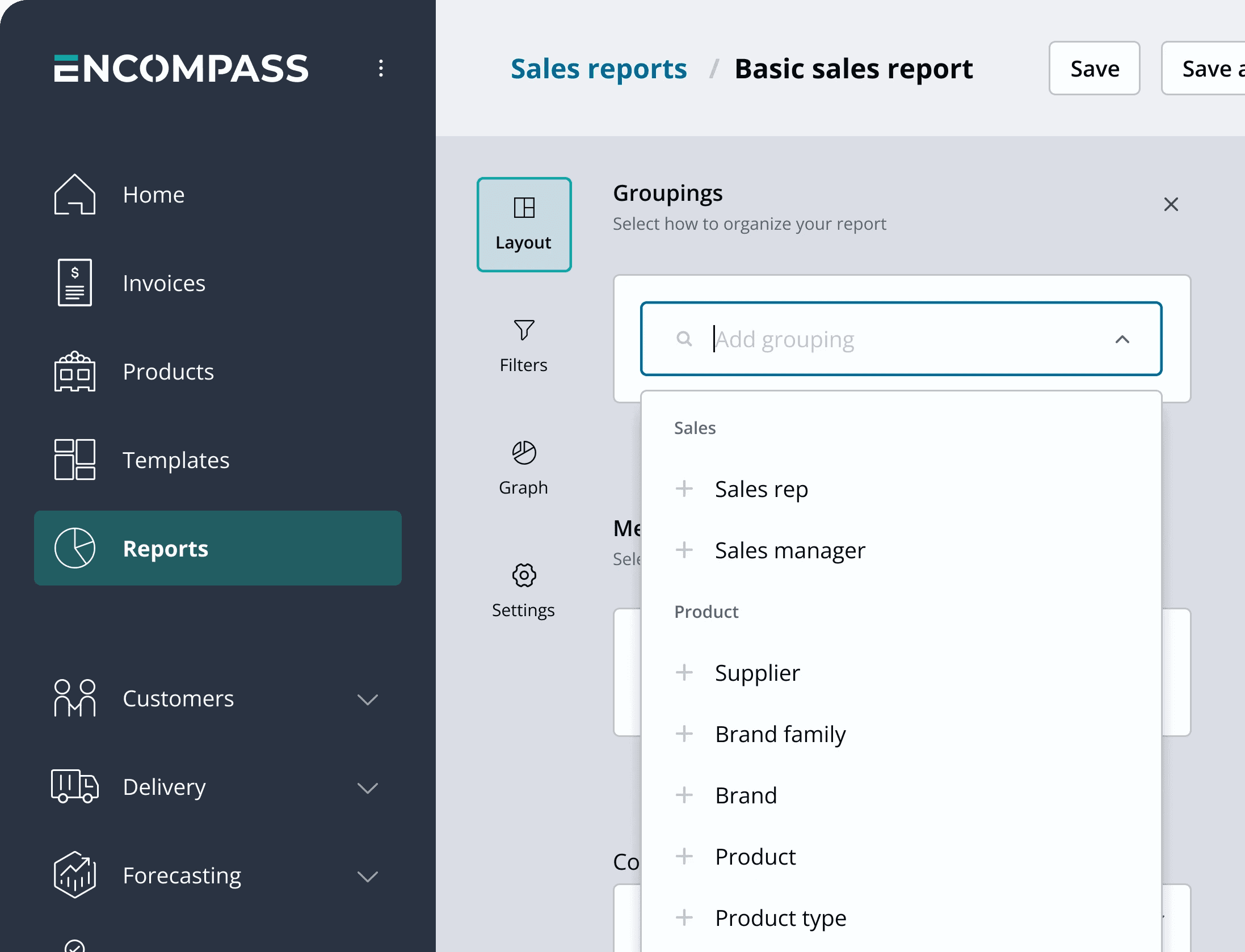
A reimagined edit panel
Our users already knew what groupings/metrics they were looking for, and were wasting time browsing through an exhaustive list. I designed a custom autocomplete that allows users to directly search for groupings and metrics. No more inconveinent drag and drop!
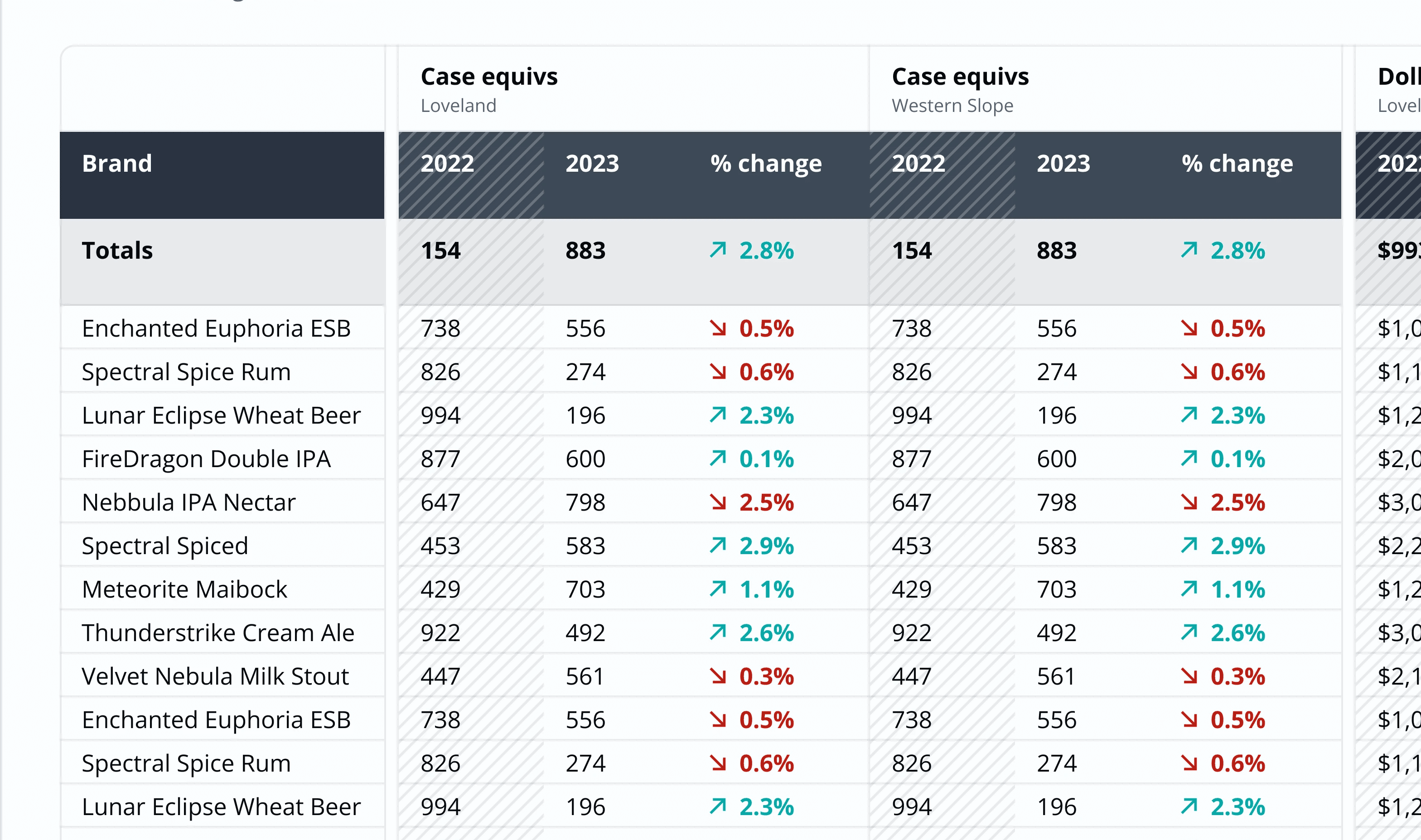
Easy-to-read timeframe comparisons
One of the most common things our users tried to see in reports were year-over-year comparisons. I designed a new report table making these comparisons easier to read.
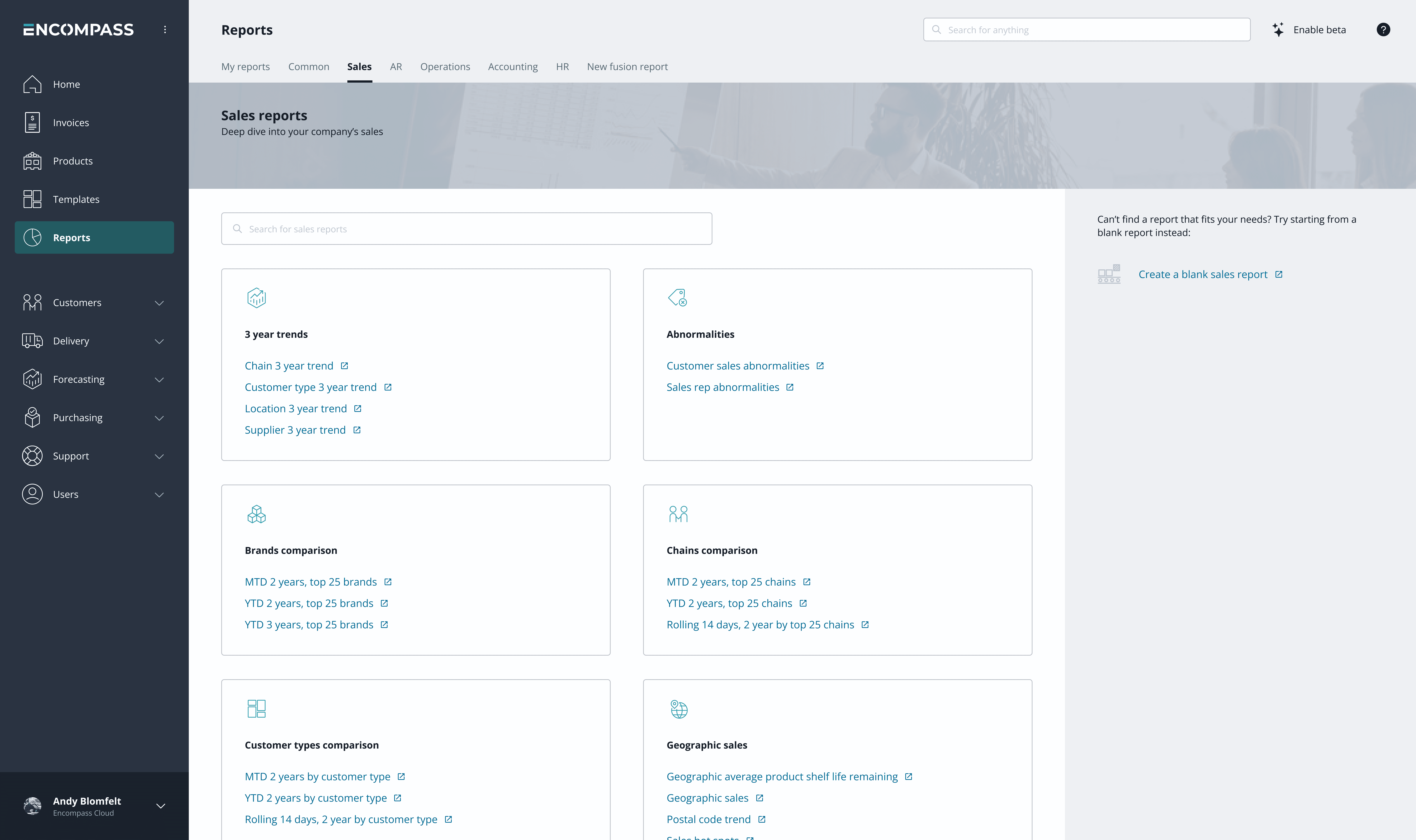
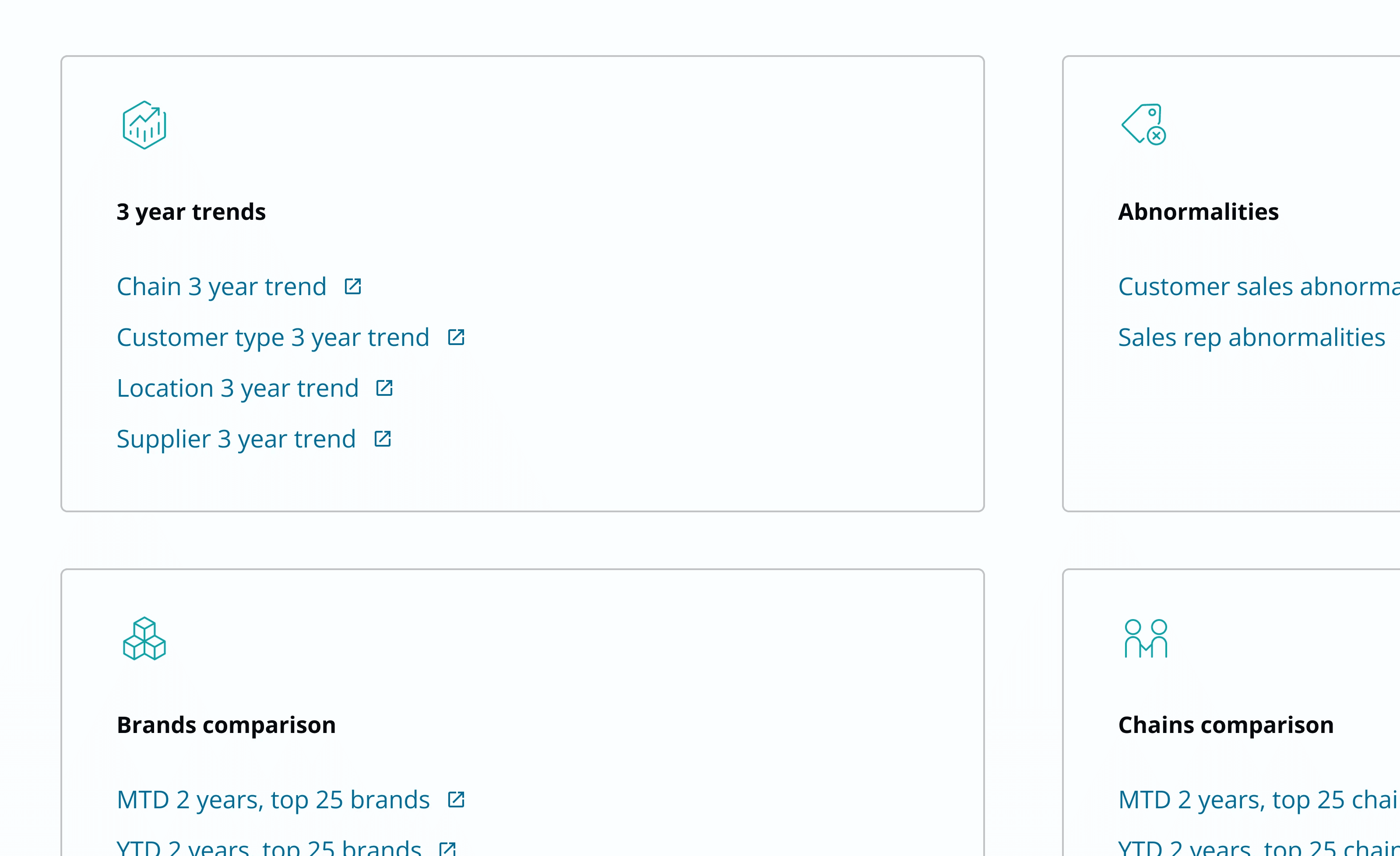
A better starting place
The new edit panel made it easier to fit more controls inside of a single report. Our starting reports were simplified, so users didn't have to scan a large list to get started.
